

What's the tea? A sip into Global Tea Production & Trade

Media: Tableau Prep, Procreate & Adobe Illustrator
Client: Shay Saharan
Target Audience: Lay Audience
April 2025
This infographic communicates data from 1961-2023 on production quantity of tea of top 11 producing countries. The top countried for tea export and import in 2023 is shown in a bar graph format. The information on tea export and import is connected with the amount of export/import value above each country. For the countries who import the most amount of tea, the tea consumption per capita is also communicated. Lastly, cultural symbolism of tea in some of the countries is explained as to why this is a globally loved beverage.
Ideation & Sketches
I wanted to communicate about data on tea in general. After doing some research, I found good data from 1961 to 2023 on production quantity of tea from each country around the world. I started ideating from this point the variables I would include in the visualization (6 variables):
• Production Quantity
• % exportation for countries over 1%
• % importation for countries over 1%
• export value
• import value
• tea consumption per capita
I started sketching ideas on how I wanted to graph this data:


Data Cleanup
I took all the data taken from 1963 – 2023 (production quantity, area harvested, yield (kg/hectare) and cleaned it up on tableau prep.
After taking it into tableau, I liked the approach of creating an interactive map where the user can slide through each year and see the change in production by each country over 62 years.
After discussing with you over a meeting about this approach, I thought more about wanting to incorporate my own illustrations. I created more graphs of exportation and importation and tried to layout on Tableau. I was unsuccessful in this and did not like how it was not very user friendly and when I imported a picture in, the quality was very low. I even tried exporting the graphs onto illustrator and seeing if I can match up my graphics from there, but it was unsuccessful.


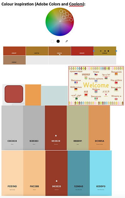
I started sketching again how I can better communicate my variables without the interactive map and getting colour inspiration for the comprehensive sketch:

Comprehensive Sketch & Feedback

Feedback from professor:
• Making the map bigger
• Make graphs larger so there are no overlapping elements
• Make legend smaller and more aligned to each graph
• Fix Sankey graph so it is placed from largest to smallest data value
• Have the tea consumption data fit on top of the circles as it is important data to highlight
• Make bar graph lines thinner
• If possible, have the graphs side by side
• In the map, including the countries with no data in greyscale


I wanted to include tea leaf shape as a data visualization so I included it for the tea consumption data. At first I had put it on each bar graph area line, however later changed it as I thought it was interfering with the other elements. Thus, I instead included it under with the name of the country. That was also hidden/ clashing with the words, so I finally put it on the of the circles.
2nd sketch:

This is the version I had for review during our one-on-one meeting and peer feedback. The map was better (I already removed the background in this screenshot). The feedback I received was that the Sankey graph was too salient thus, I should bring down the opacity of some of the countries. I should also add a grey layer for the countries on the map with no data.
I changed the opacity of the colours of the Sankey graph as it was visually salient, which is not my intent. As for the map, I was having trouble with exporting the grey out map with transparent background for the areas with no tea production. After troubleshooting through other data websites or trying to remove the white background using Adobe Photoshop, I decide to just draw out the grey map area using Procreate. This allowed me to have more flexibility with the colours as well.


Cultural Symbolism Section
I also added a cultural symbolism section, talking about the different variation of teas that are commonly known around the world, highlighting some countries. This adds a visual appeal to the overall data visualization.
